INFO 1311 - Web Page Creation
Assignment 5 (50 points)
Responsive design is built around the concept of media queries that target specific devices and viewport sizes. When using the Mobile First strategy (section 7.11), you can code up your initial CSS given a mobile perspective and then use media queries to create additional styling as the viewport size increases.
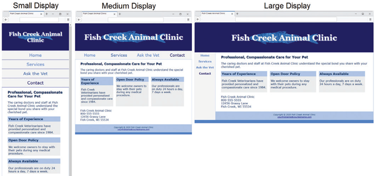
In this assignment we will create a responsive layout using media queries and the Mobile First strategy. The files I have provided are configured using a page layout that works well with smaller mobile devices. You will then code media queries and additional CSS to create two more layouts for when the design "breaks" as the browser viewport gets larger. When the assignment is complete, you will have created CSS code for a small, medium and large layout design as shown below:
Task 1: Modifying the HTML Files:
- Save these five files to your module5 folder by right-clicking on the link and selecting Save Link As...:index.html, fishcreek.css, bigfish.gif, lilfish.gif, and services.html. The layout used in these files is intended for narrow mobile screens. Resize your browser to be narrower until your display is similar to the small display shown above. This simulates mobile display.
- Open the index.html and services.html files and add a viewport meta tag that configures the width to the device-width and sets the initial-scale to 1.0. Save both HTML files.
Task 2: Creating the Media Queries:
When using the Mobile First Strategy, the order of your CSS code is important. All CSS rules created for the smallest display should come first. The media queries created for the medium and large displays should be placed at the end of the file and be organized from the smallest display size to the largest display size.
- Configure a Medium Layout. --Edit the CSS and the web pages to configure a more pleasing display on a wider viewport, setting 600px as the breakpoint for the first media query. When you test your web pages and trigger the media query, the layout in the Medium Display will be implemented and your pages should look similar to the Medium Display in the figure above.
- Configure the CSS -- Using a text editor and open the fishcreek.css style sheet. Place your cursor below the existing styles. Configure a media query that is triggered when the minimum width is 600px or greater. Code the following styles within the media query.
- Code styles for the header element selector. Configure bigfish.gif as the background image.
- Code styles for the h1 element selector. Set font size to 3em.
- Code styles for the nav ul selector. Configure the flex container with rows that do not wrap. Also set justify-content to space-around.
- Code styles for the nav li selector. Set the bottom border to none.
- Code styles for the #flow id selector. Configure a flex container. The flex direction is row. Allow the content to wrap.
- Code styles for the section element selector. Set minimum width to 30%. Set the flex property to 1. Setting the flex property to the value 1 will allocate equal areas for each section flex item.
- Code styles for the #mobile id selector. Set display to none.
- Code styles for the #desktop id selector. Set display to inline.
- Save your fishcreek.css file. Use the CSS validator (http://jigsaw.w3.org/css-validator) to check your syntax. Correct and retest if necessary.
- Configure the HTML -- You need to rework the content area on the web pages
- Using a text editor and open index.html. Locate the section elements. Code a div assigned to an id named flow that contains all section elements. Save the file.
- Using a text editor and open services.html. Locate the section elements. Code a div that is assigned to an id named flow that contains all the section elements. Save the file.
- Configure a Large Layout -- Edit the CSS to configure a second media query with a 1024px breakpoint that will configure a grid layout with two columns. When you test your web pages and trigger the media query, the layout in the Large Display wireframe will be implemented and your pages should look similar to the Large Display in the figure above.
- Configure the CSS -- Using a text editor, open the fishcreek.css style sheet. Place your cursor below the existing styles. Configure a media query that is triggered when the minimum width is 1024px or greater. Within the media query, configure a feature query to check for support of grid layout. Code the following styles within the feature query.
- Configure the grid areas.
- Code styles for the header element selector: set grid-area to header.
- Code styles for the nav element selector: set grid-area to nav.
- Code styles for the main element selector: set grid-area to main.
- Code styles for the footer element selector: set grid area to footer.
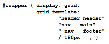
- Configure the #wrapper id selector as a grid container. Use the grid-template property to describe the grid layout shown for large display in the figure above. Use 180px for the width of the navigation area. The CSS follows:
- Configure the navigation area. Code styles for the nav ul selector to set the flex-direction to column. Also configure 1.25em bold font.
- Save your fishcreek.css file. Use the CSS validator (http://jigsaw.w3.org/css-validator) to check your syntax. Correct and retest if necessary.
Task 3: When Finished...
All students need to upload your assignment to your web site on the server and modify your INFO1311 home page (default.htm) as instructed below:
- Upload the module5 folder into the public_html folder on your web site on the server using FTP. Make sure that the folders and files stay organized on the server exactly the same as they are organized on your local drive.
- Open your default.htm file and add a hypertext link to index.html in the module5 folder using the label Assignment 5 in the list of Homework Assignments
- Save the default.htm file and upload it to the public_html folder. You will replace the file that is already there by the same name. I recommend that you open your revised INFO1311 Home Page that you uploaded to the server
in the browser and test your links to your Assignments.
- Copy the URL to your assignment into the assignment dropbox in Canvas.